Polar Pelmeni
Development of a logo and brand identity for a premium dumpling manufacturer.
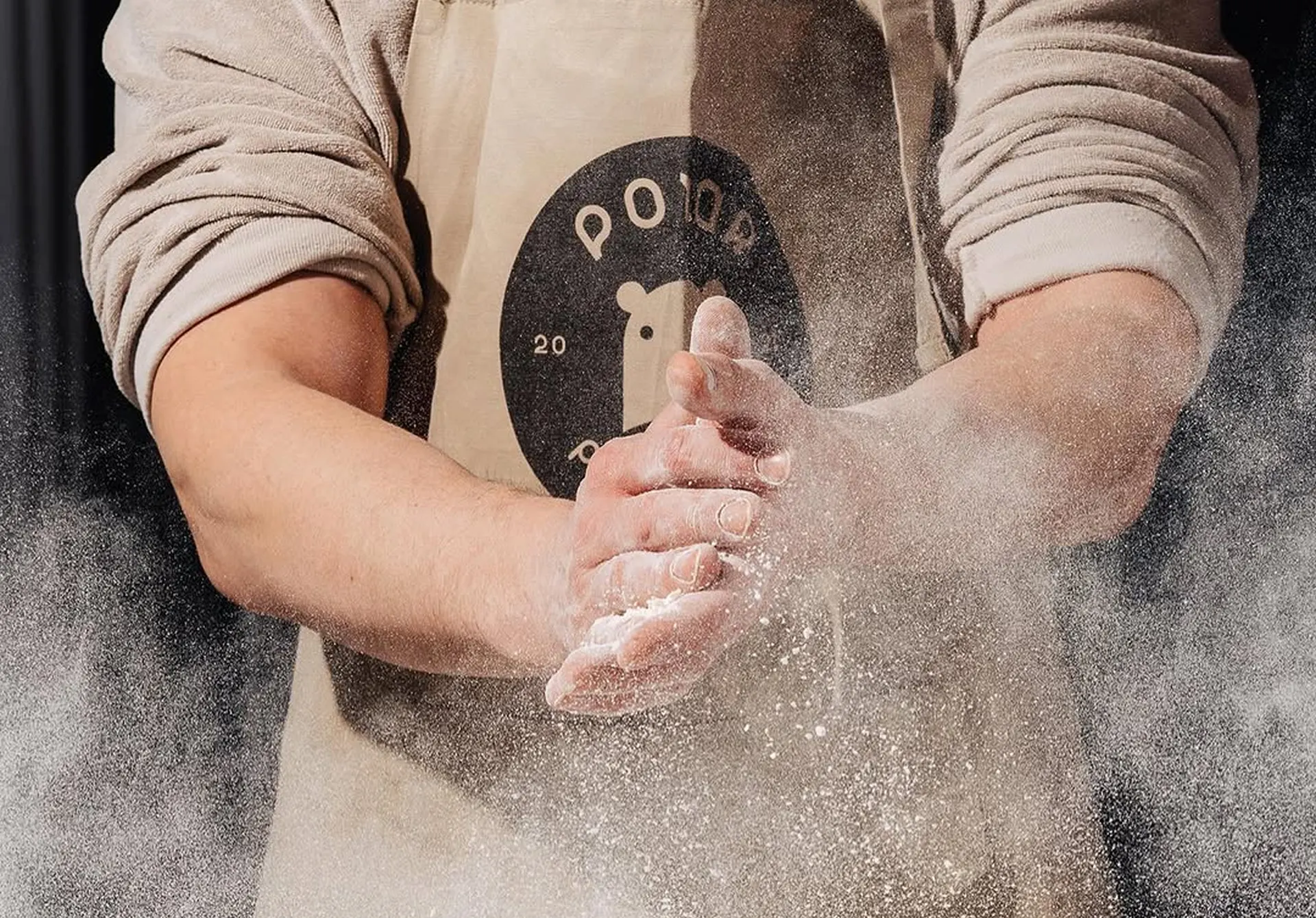
Logo Concept
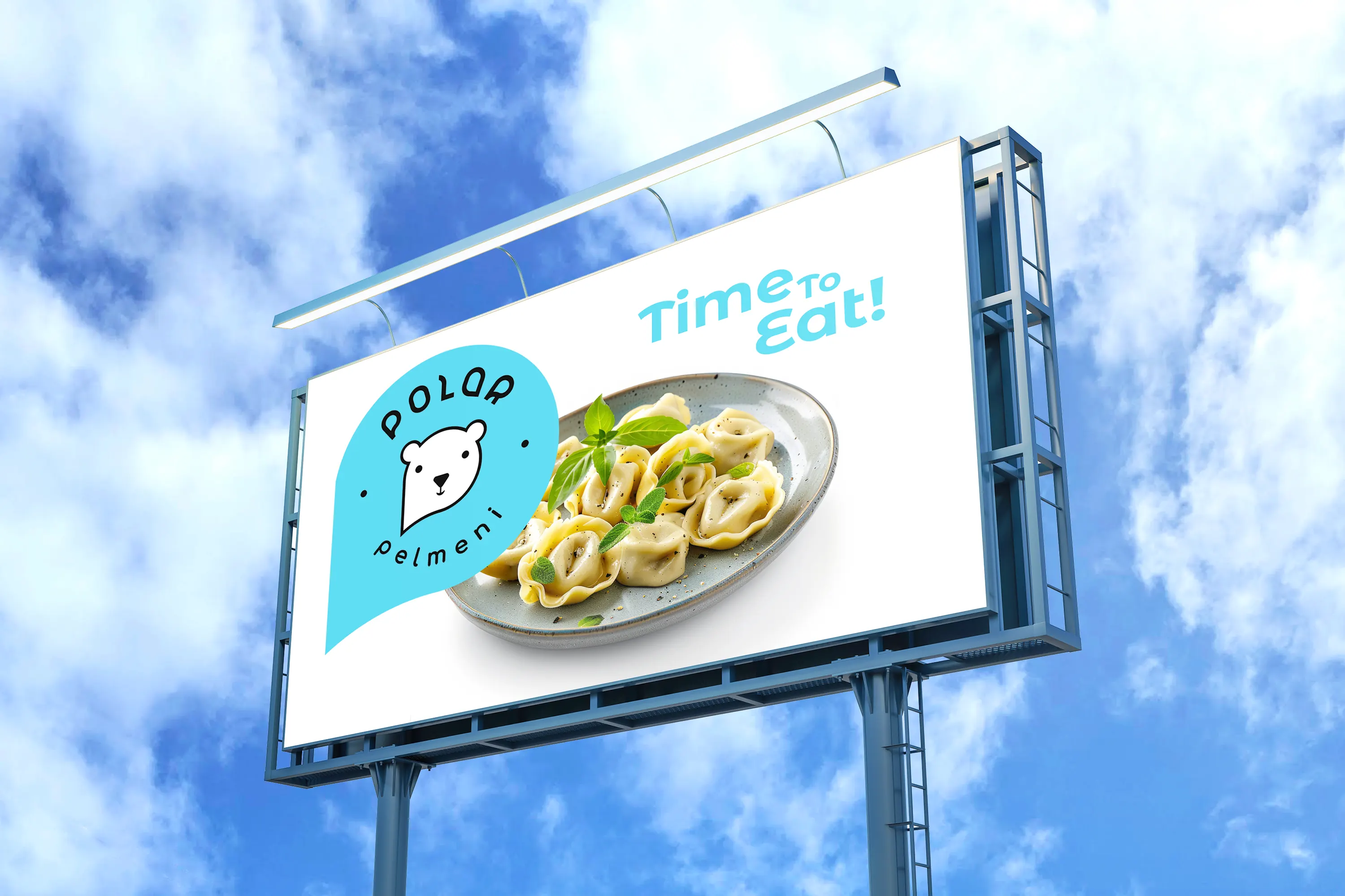
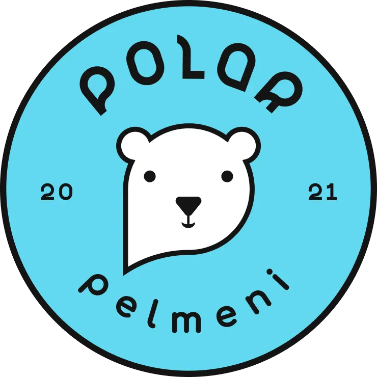
The logo is built around a friendly polar bear character that serves as the central element of the Polar Pelmeni brand. Combining openness, warmth, and approachability, the character creates a memorable visual identity that helps the brand stand out while building trust with its audience.
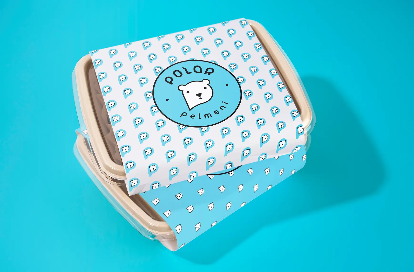
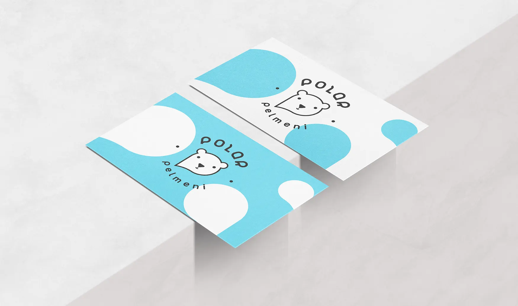
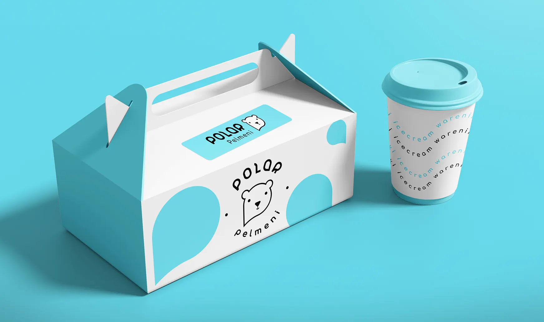
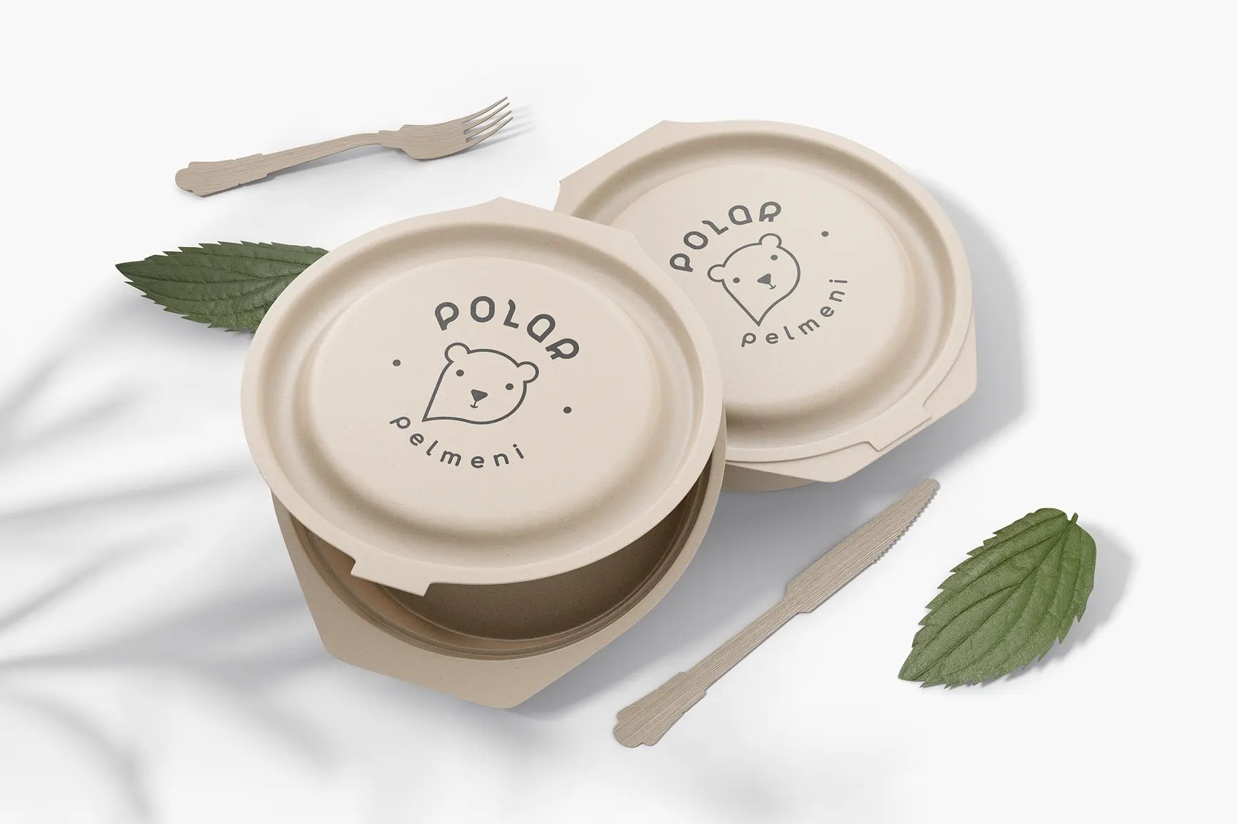
The logo was designed to remain clear and recognizable across a wide range of applications, including product packaging, fast-food café branding, marketing materials, and digital media.



Colors
Color Palette
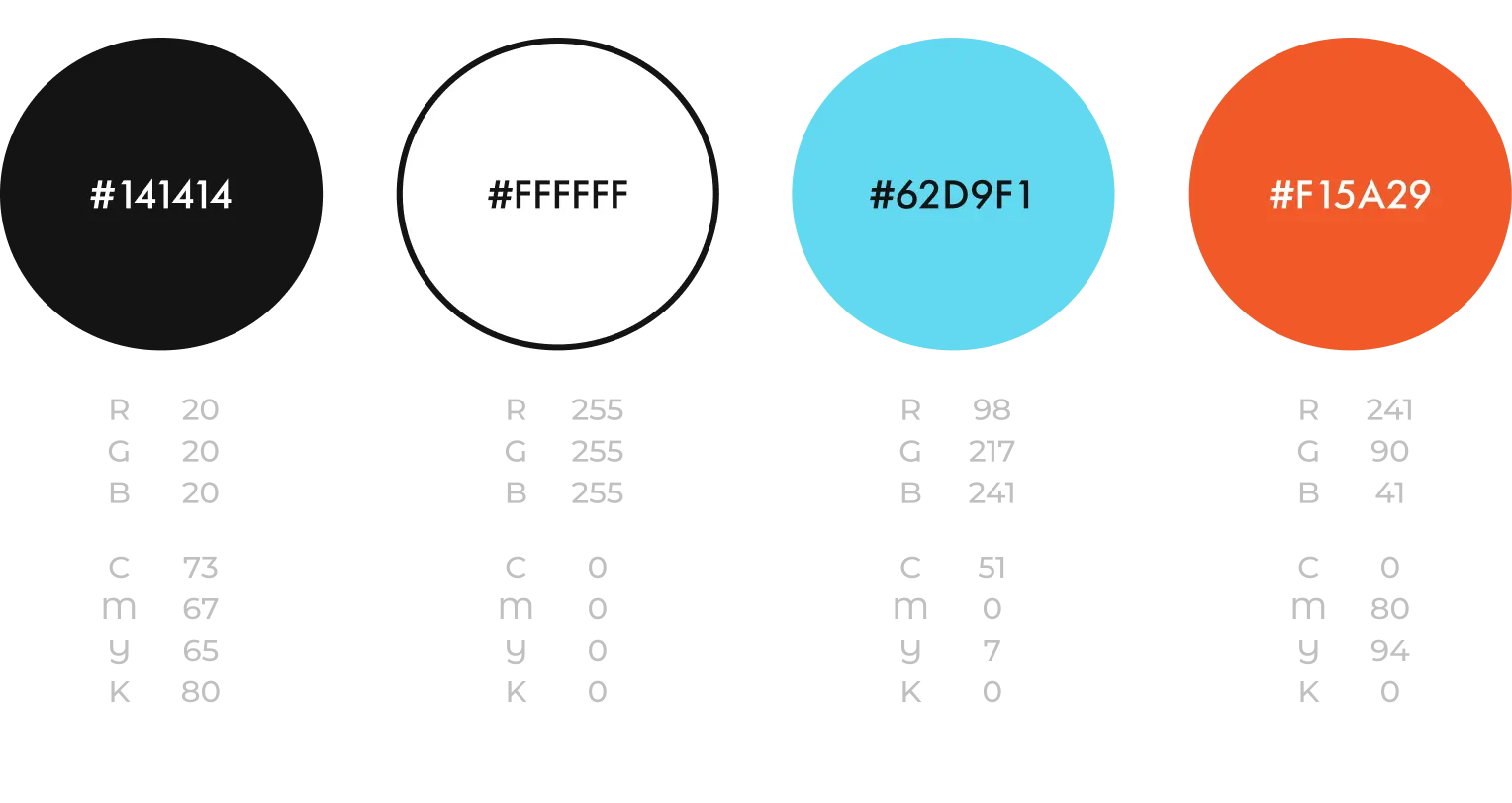
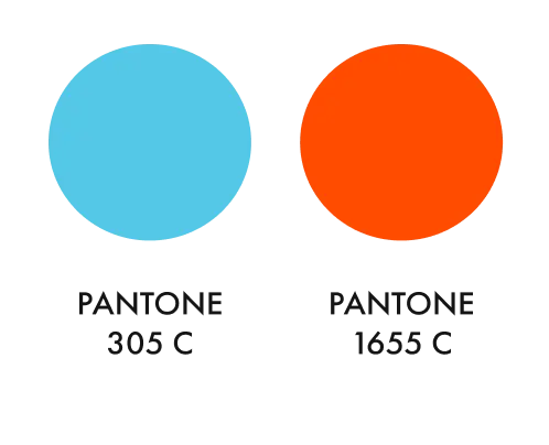
The brand palette combines two contrasting colors, each representing one of the brand’s core business directions.
Deep blue represents frozen products, emphasizing freshness and quality, while warm orange reflects the inviting atmosphere of the fast-food café, symbolizing warmth, freshly prepared food, and hospitality.
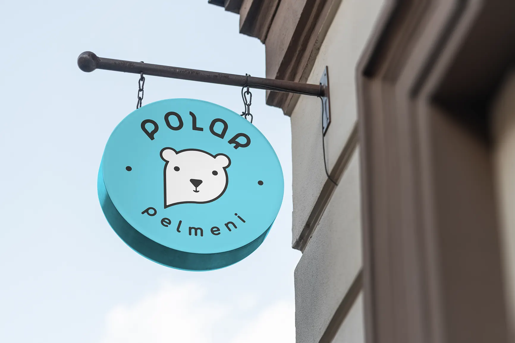
Logo versions




Brand Elements
In addition to the logo, a system of supporting graphic elements was developed to create a cohesive and recognizable visual identity across all brand touchpoints.
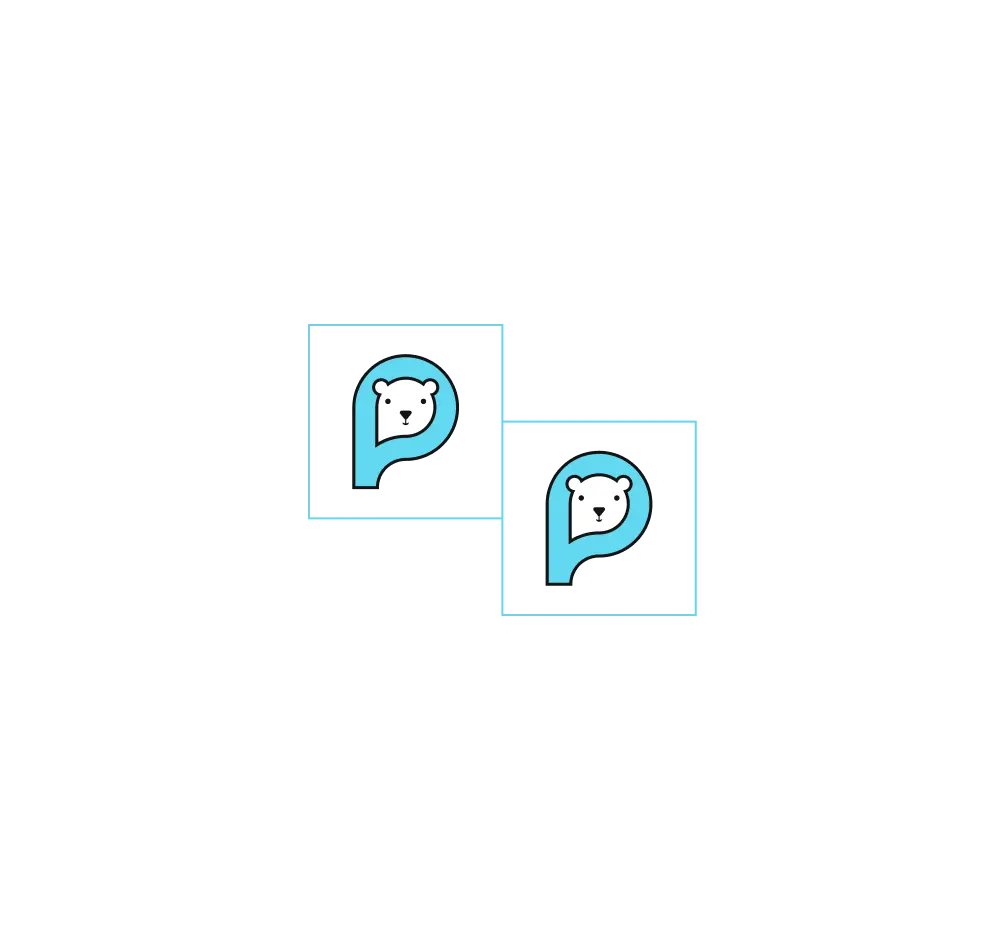
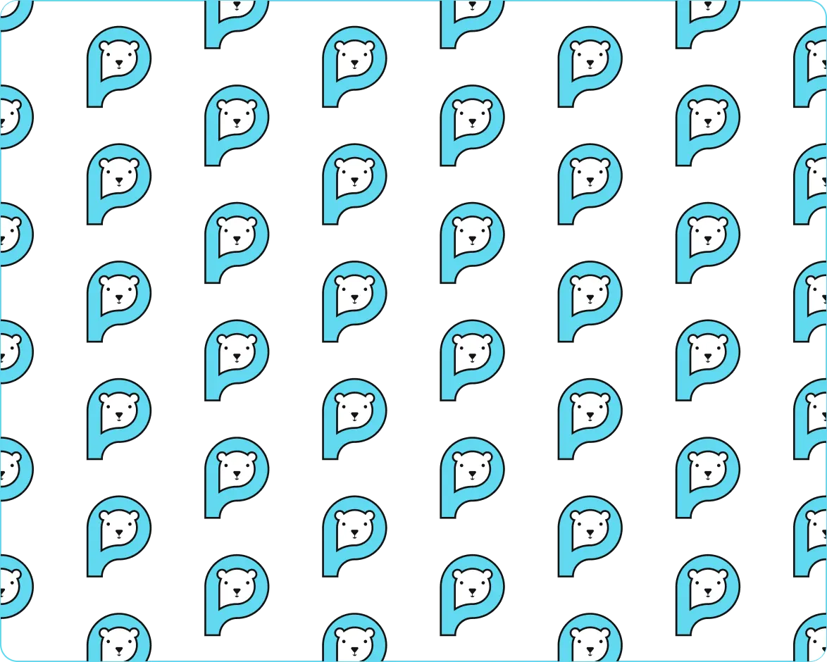
Primary Pattern
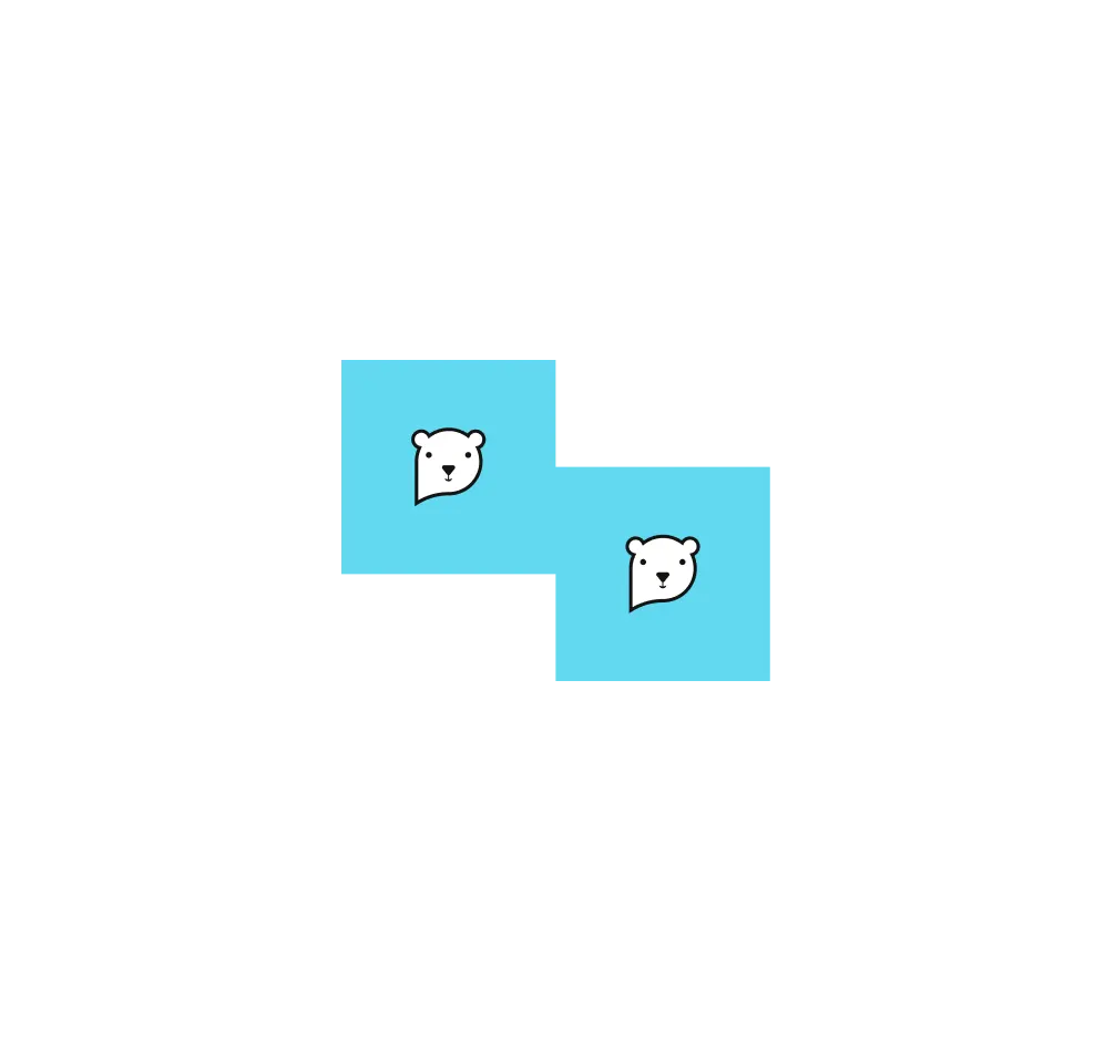

Secondary Pattern
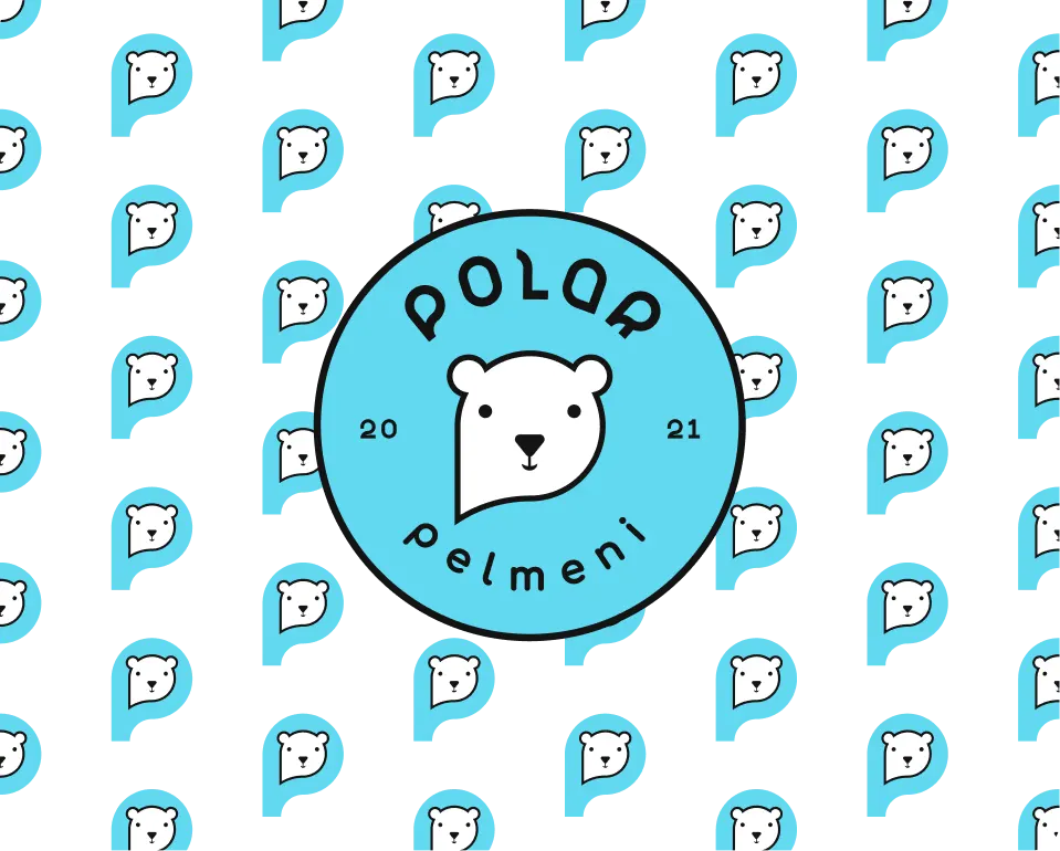
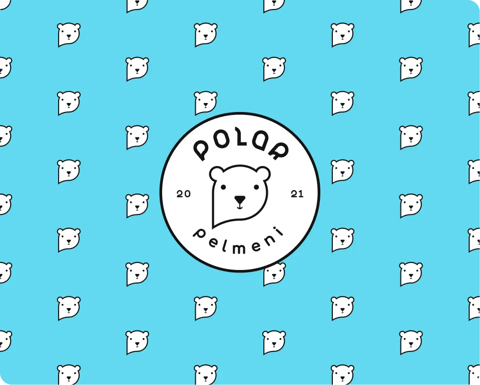
Logo Pattern System
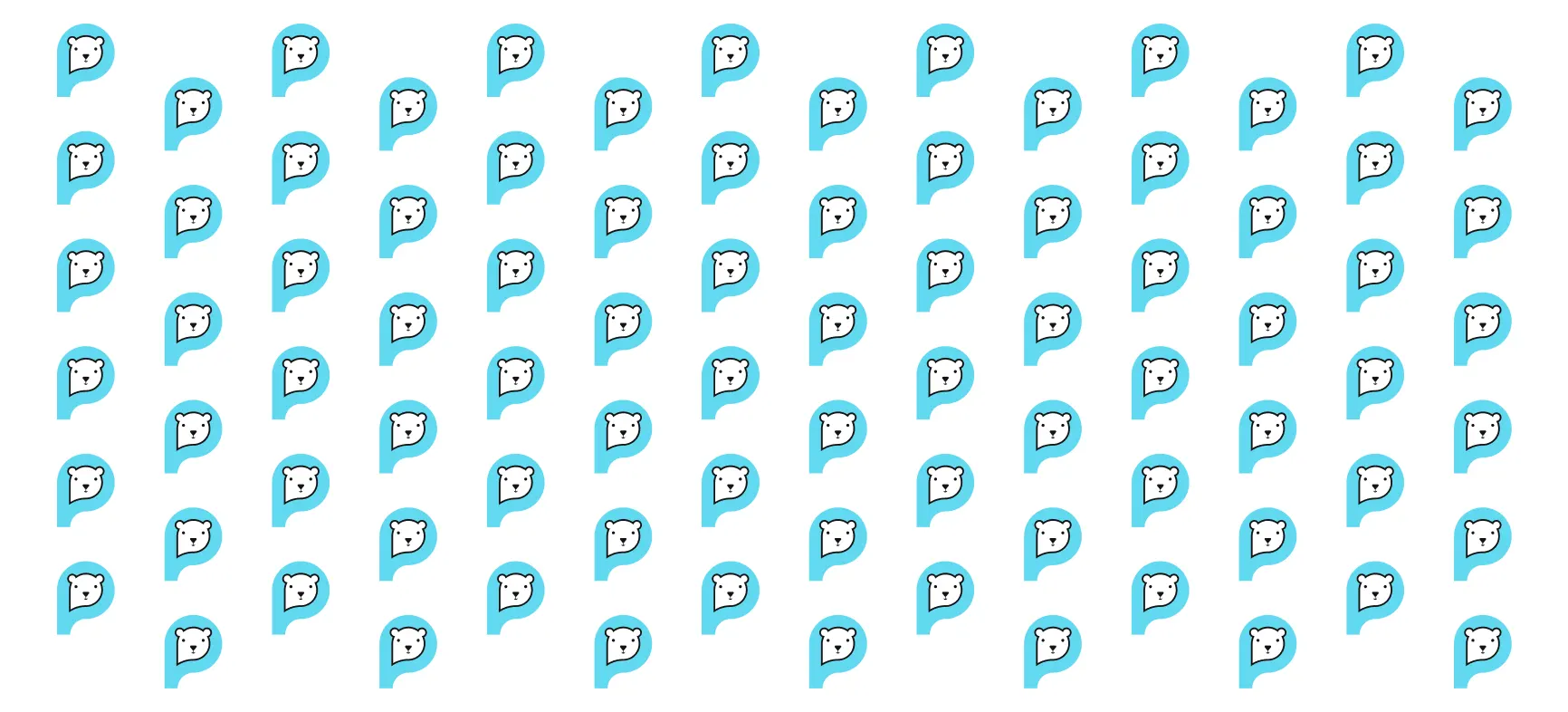
The flexible identity system allows the brand to maintain a consistent visual language across packaging, café environments, and marketing materials, creating a cohesive and recognizable brand experience.